Presentation & Brand Identity Architect
Clear beats clever. Every time.
QUICK JUMP NAVIGATION BAR
Hi, I’m Katie Martone
Good design shouldn’t make you work harder. I turn ideas and information into clear, engaging visual communication across presentations, digital, print, and everything in between.
Located in Western NC

SARAH TURNER
Message Distillation + Audience-Specific Communication + Visual Consistency at Scale
CHALLENGE
Sarah Turner is a copywriter who trains a specific, often skeptical audience — burnt-out nurses, teachers, and stay-at-home moms — to become copywriters themselves.
Her challenge wasn't the message; she wrote that herself. It was turning that message, along with her existing brand assets, into video content paced and structured well enough to actually hold that audience's attention across ads, workshops, and a full book launch.
EXECUTION
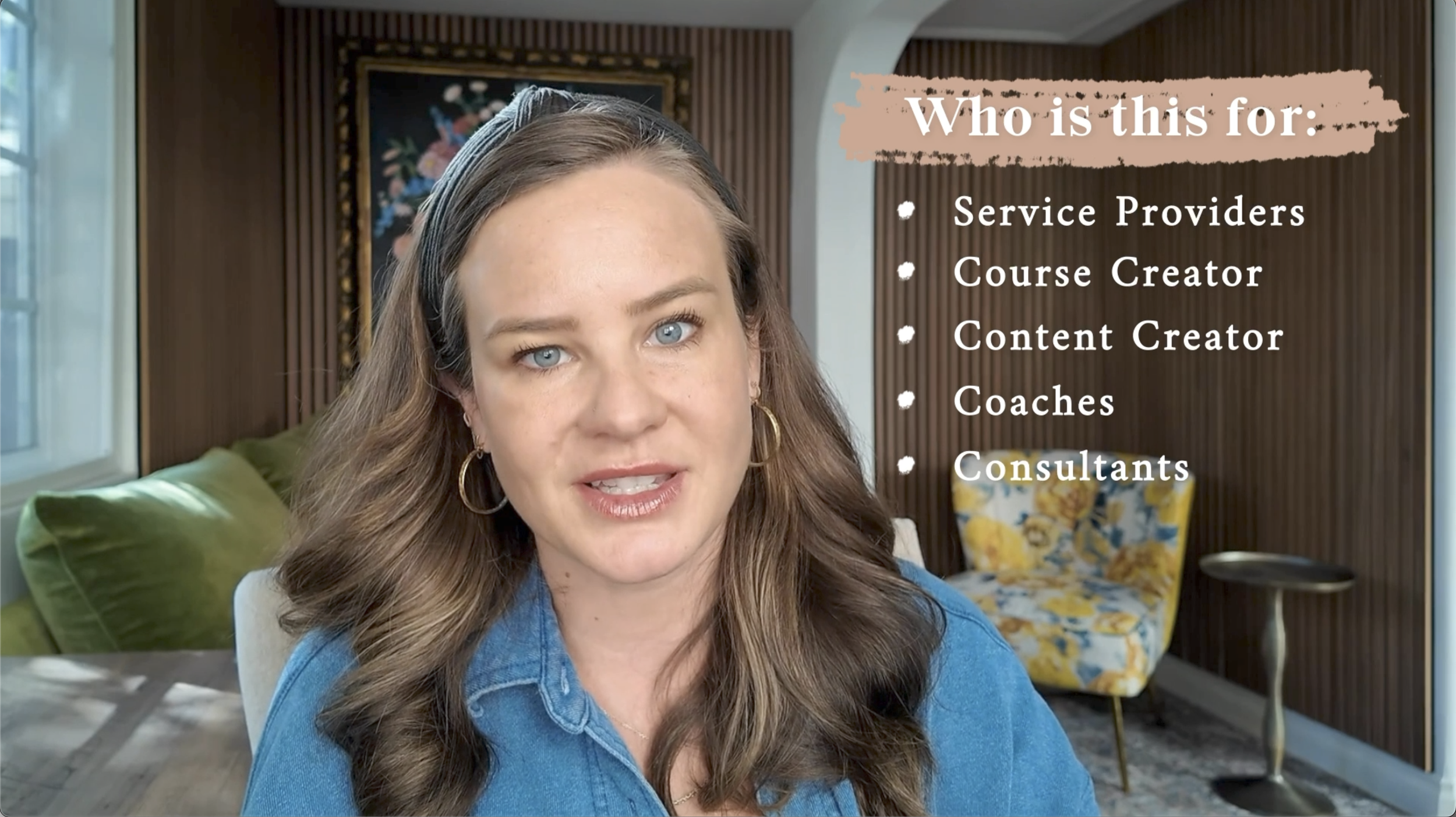
I took those raw materials and built them into a finished video — structuring the pacing so the message unfolded clearly, and sourcing b-roll and music to support (not distract from) what she was saying.
My Role
Edited and paced video across three ongoing lines of work: Meta ad campaigns (Instagram, YouTube, Facebook), long-form MasterClass and workshop videos, and video content for her book launch, Bet On Yourself. Sourced supporting b-roll and music, and built pacing that translated her existing brand assets and message into a format built to hold attention.
A three-year, freelance, project-by-project relationship. Sarah provided the message, copy, MasterClass slide decks, and brand assets.
APPLICATION
Delivered across Instagram, YouTube, Facebook (via Meta ads), and her website over three years.
Sarah owned and tracked the campaign's performance metrics directly.
95+ individual ads
10+ long-form YouTube/MasterClass videos
Full video campaign supporting the launch of her book “Bet On Yourself.”
OUTCOME
Sarah Turner was a client who kept coming back, project after project, for three years straight.
No audience engagement data was shared with me as the contractor. Rather, the volume (95+ ads, 10+ long-form videos, and a full book launch) and duration of the relationship (3 years) stand as the real proof.
PROCESS - HOW I THINK
Clear ideas outlast flashy design.
I start by understanding the problem, then organize the information and build a clear path forward. The visuals come after that.
If the audience has to work to understand the message, the design isn't doing its job.
01 — Get My Bearings
Do my homework before choosing a direction.
02 — Capture the Whole Picture
Listen first. Then make sure we’re solving the same problem.
03 — Untangle the Problem
Whole picture → find the tangle.
04 — Build the Path
Shape how the information should unfold.
05 — Create Visual Rules
The fun part.
06 — Find the Knot. Smooth Out. Repeat.
Diagnose → fix → zoom out → repeat.
Clear beats clever. Every time.
The AI Boundary
AI can help me think. It cannot think for me.
I use AI for:
Research acceleration → brainstorming → organization → copy critique → idea exploration → technical problem-solving → visual exploration.
I don't use AI for:
Truth → client meaning → final creative direction → design judgment → client relationships → final design decisions.
Most importantly: AI never gets to make up the creative direction.
Building the System + Enforcing the Rules + Scaling Across Applications
CHALLENGE
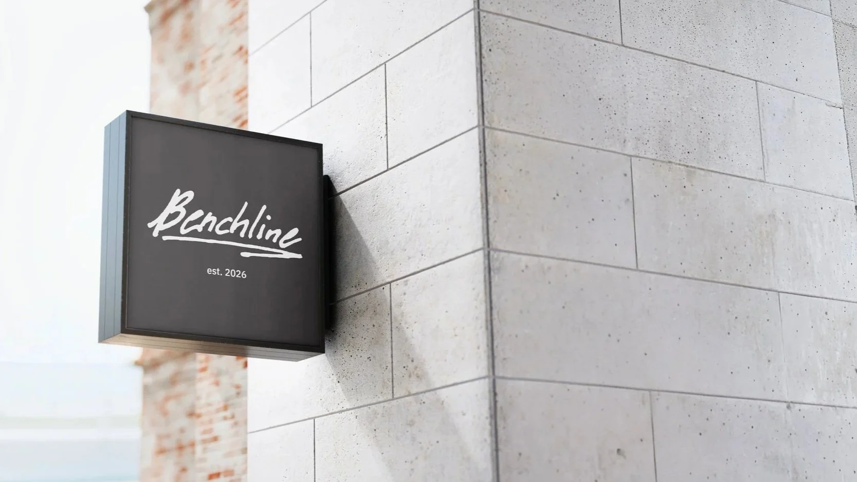
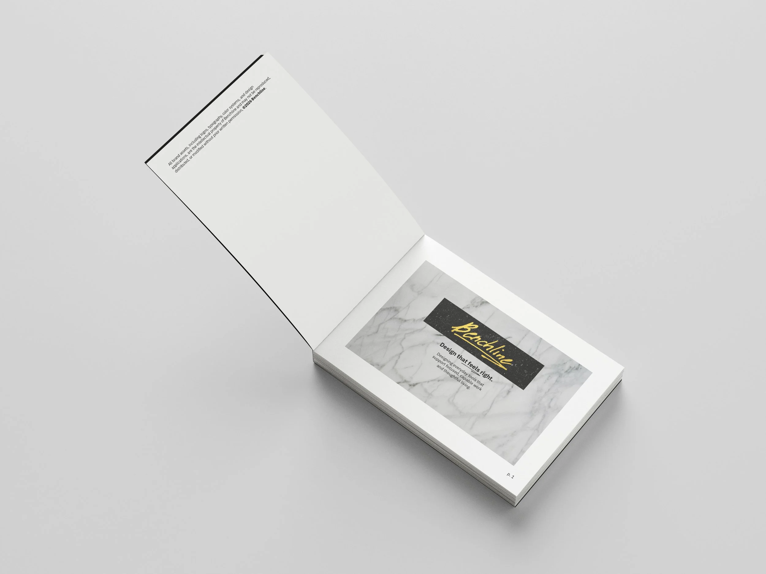
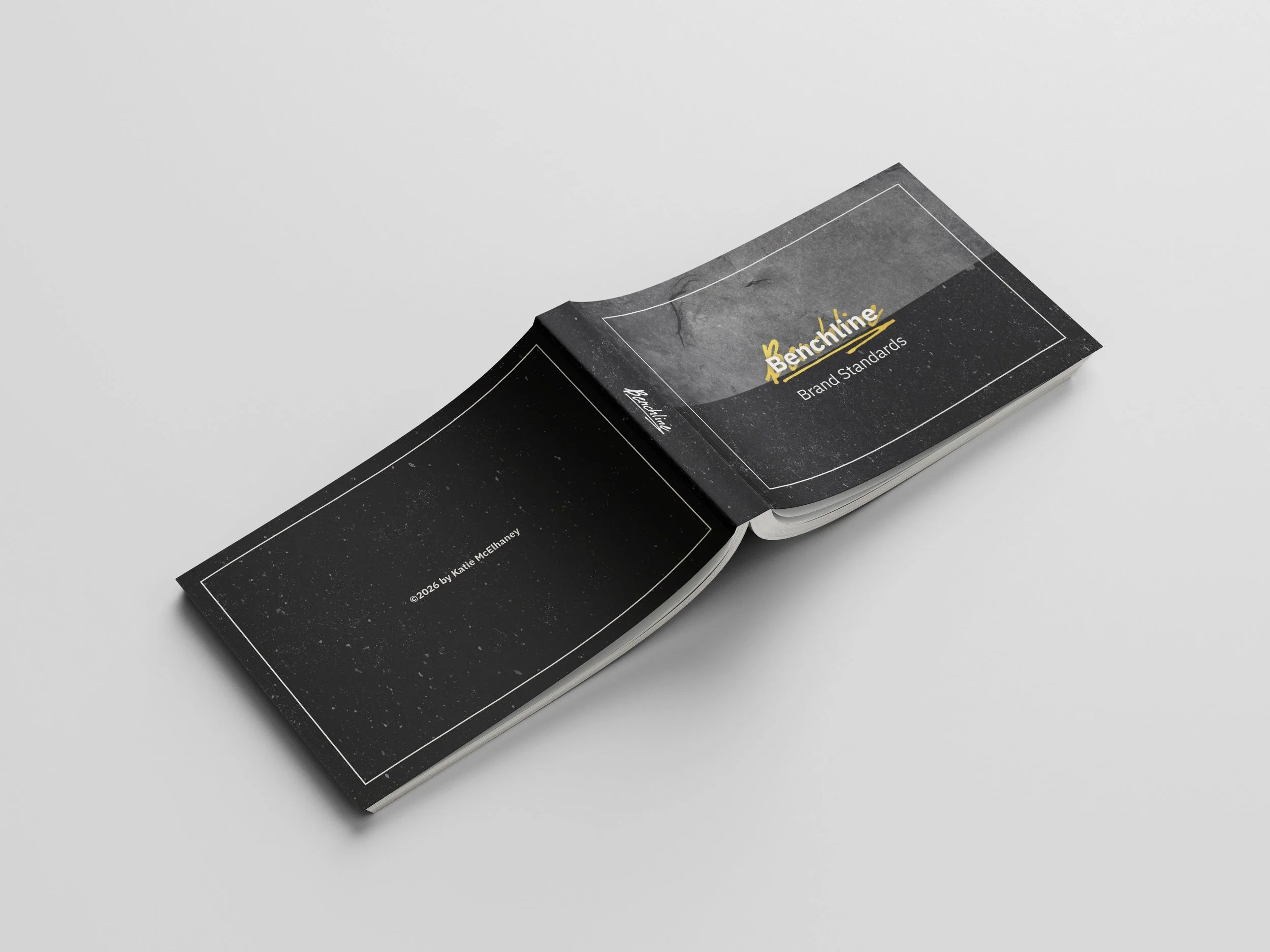
A self-directed, fictional brand identity project for Benchline, an EDC (everyday carry) company built around a specific tension: elegant, high-quality design paired with genuine everyday practicality and sustainability.
The goal was to build a brand that could hold that balance visually, not just claim it in a mission statement.

Audience:
Primary: 24–45-year-old designers, creatives, tradespeople, and knowledge workers who buy fewer, better things and expect tools that age well.
Secondary: minimalists, thoughtful gift buyers, and people actively moving away from disposable products.
EXECUTION
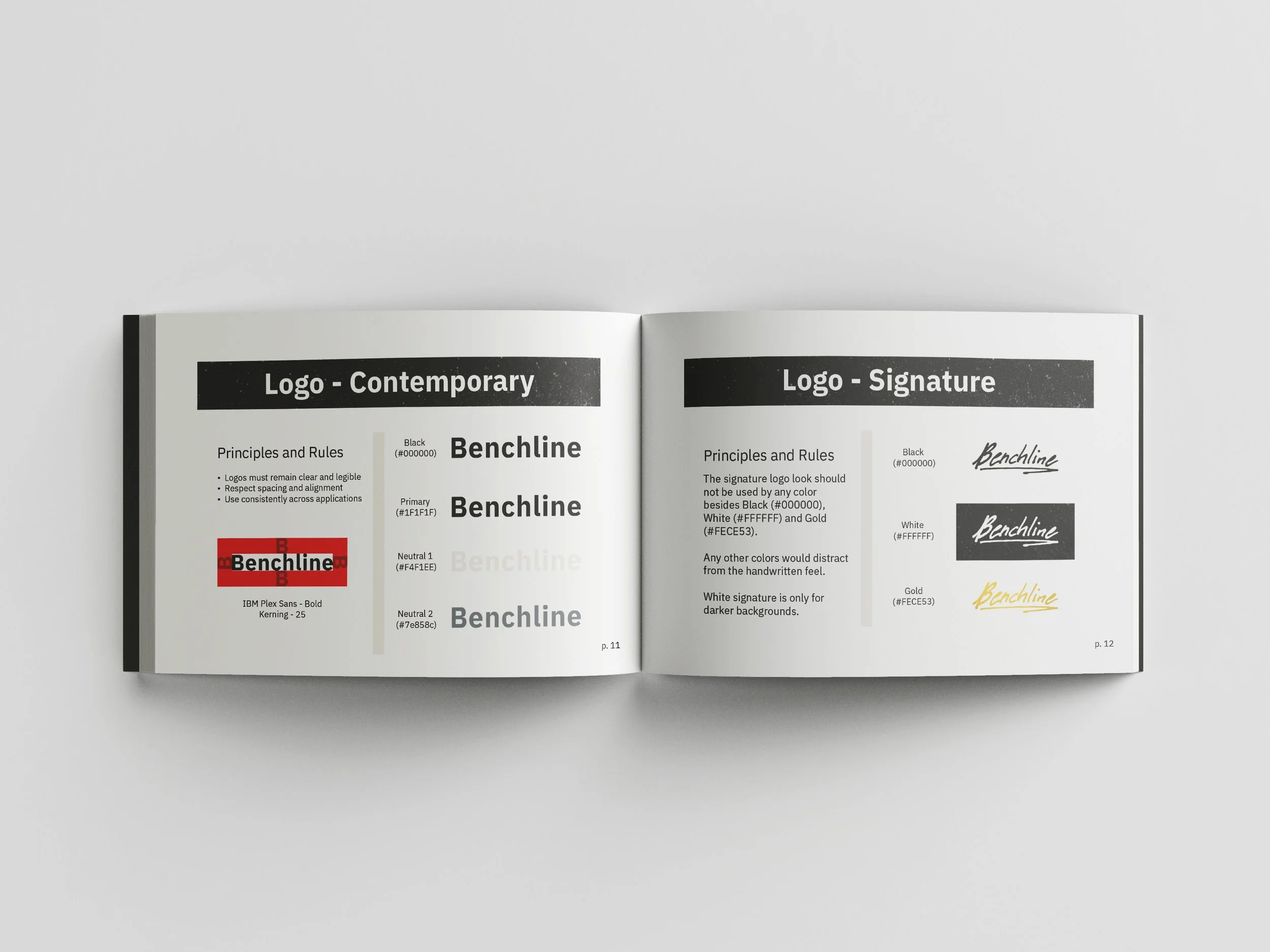
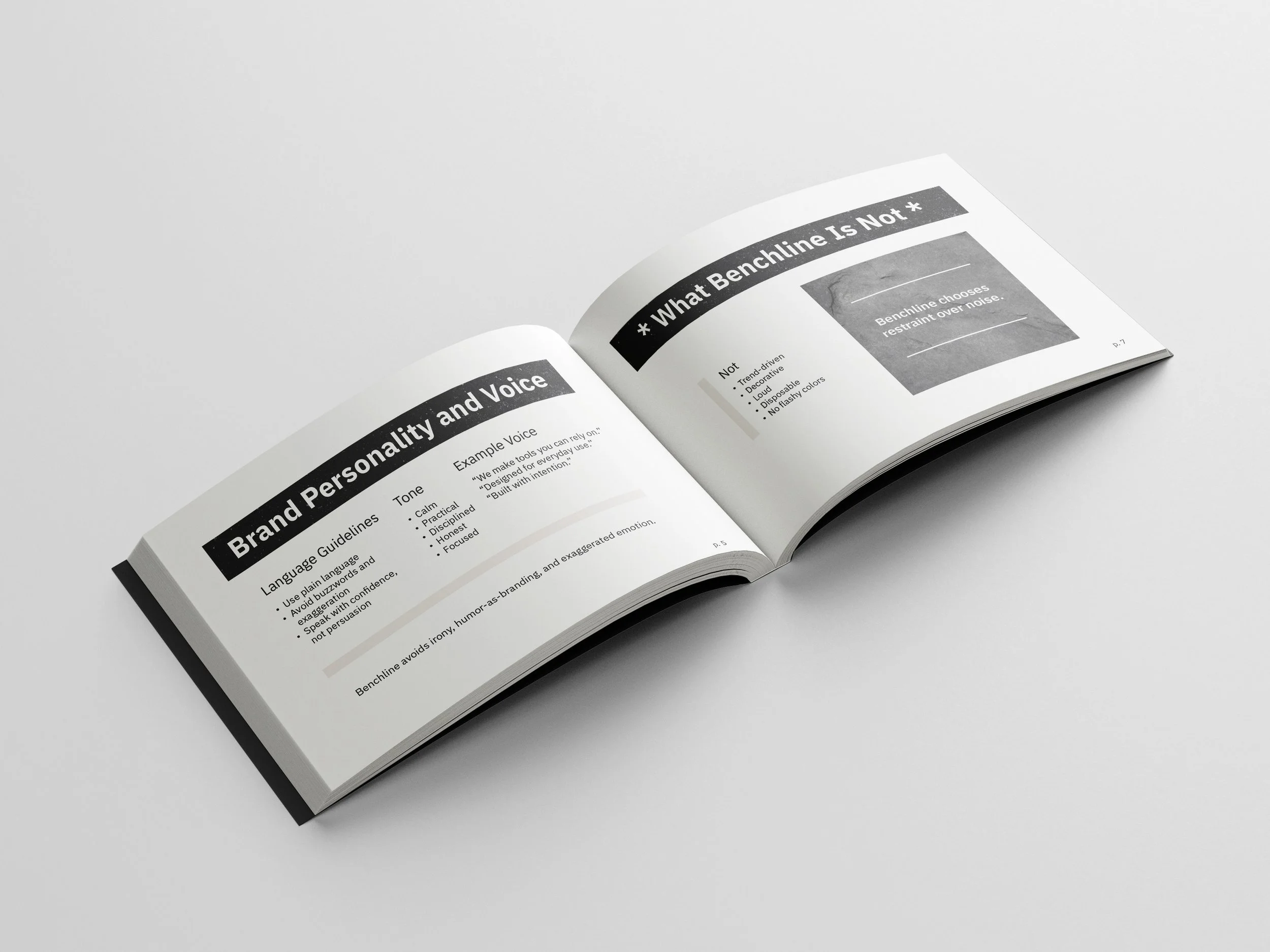
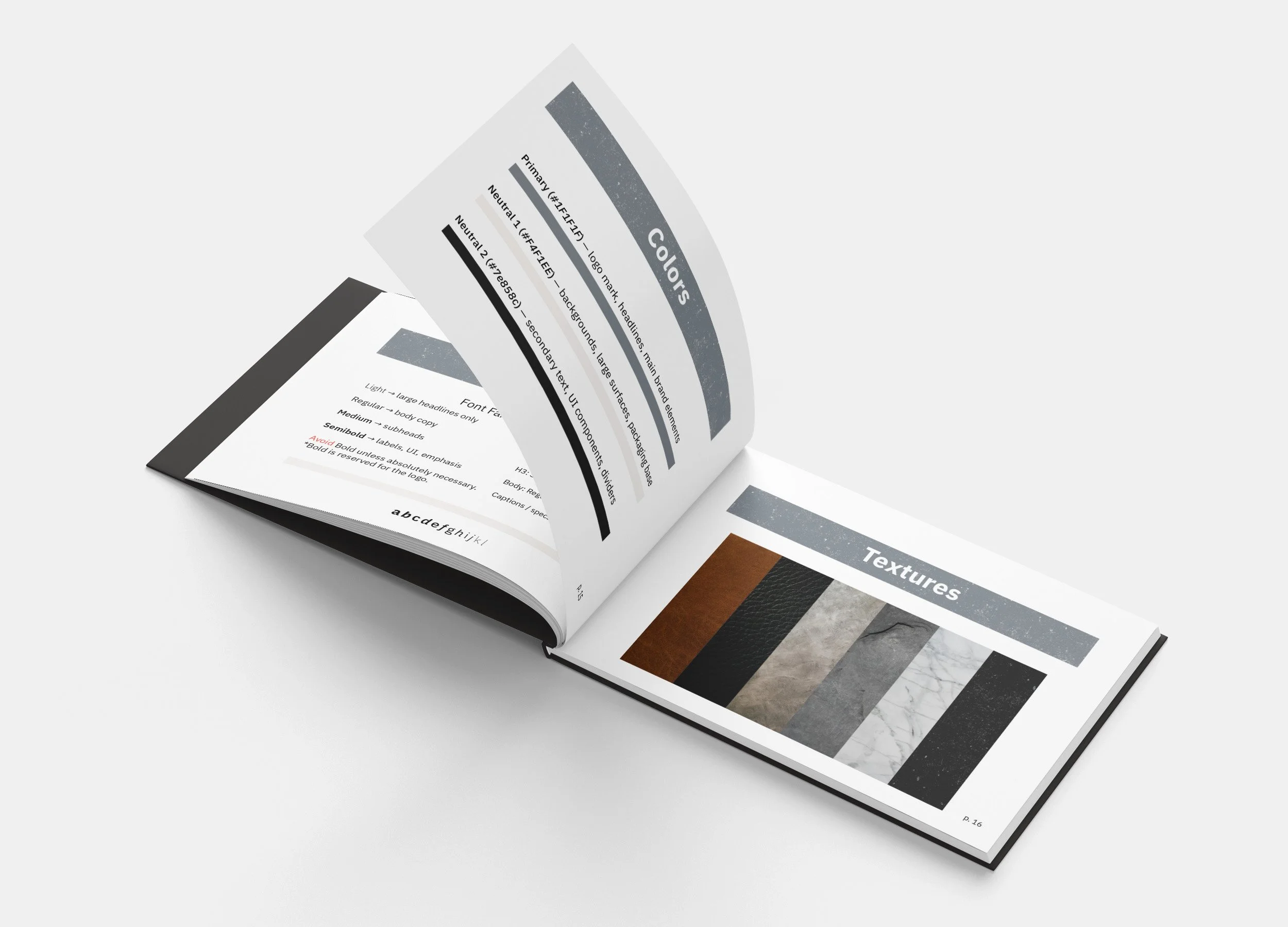
Built the complete brand system from the ground up: logo, full visual identity, packaging, brand guidelines, social content guidelines, and copywriting voice
Then applied that system across real mockups to prove it holds up in practice, not just on a guidelines page.


APPLICATION
My Role:
Designed the logo and identity system, wrote the brand guidelines, developed the copywriting voice, designed packaging, and produced social content mockups

Brand Packaging
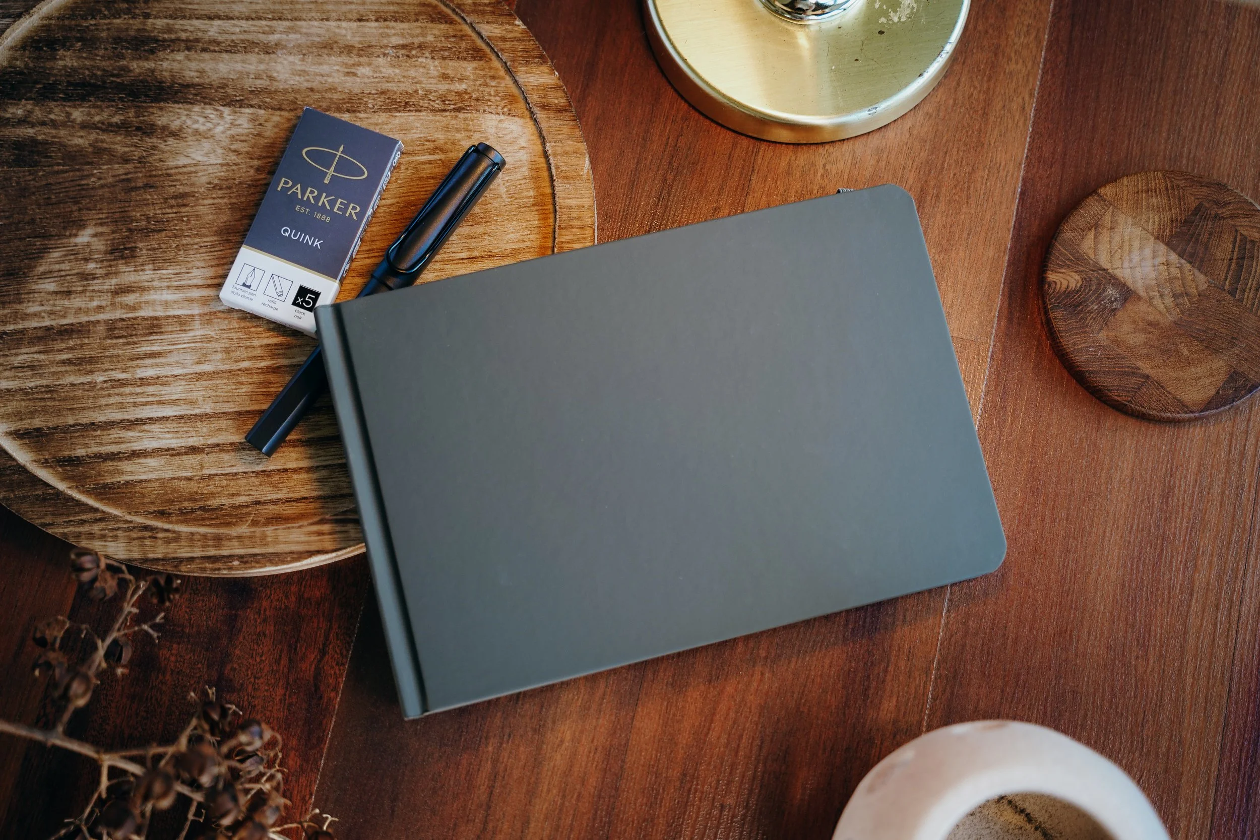
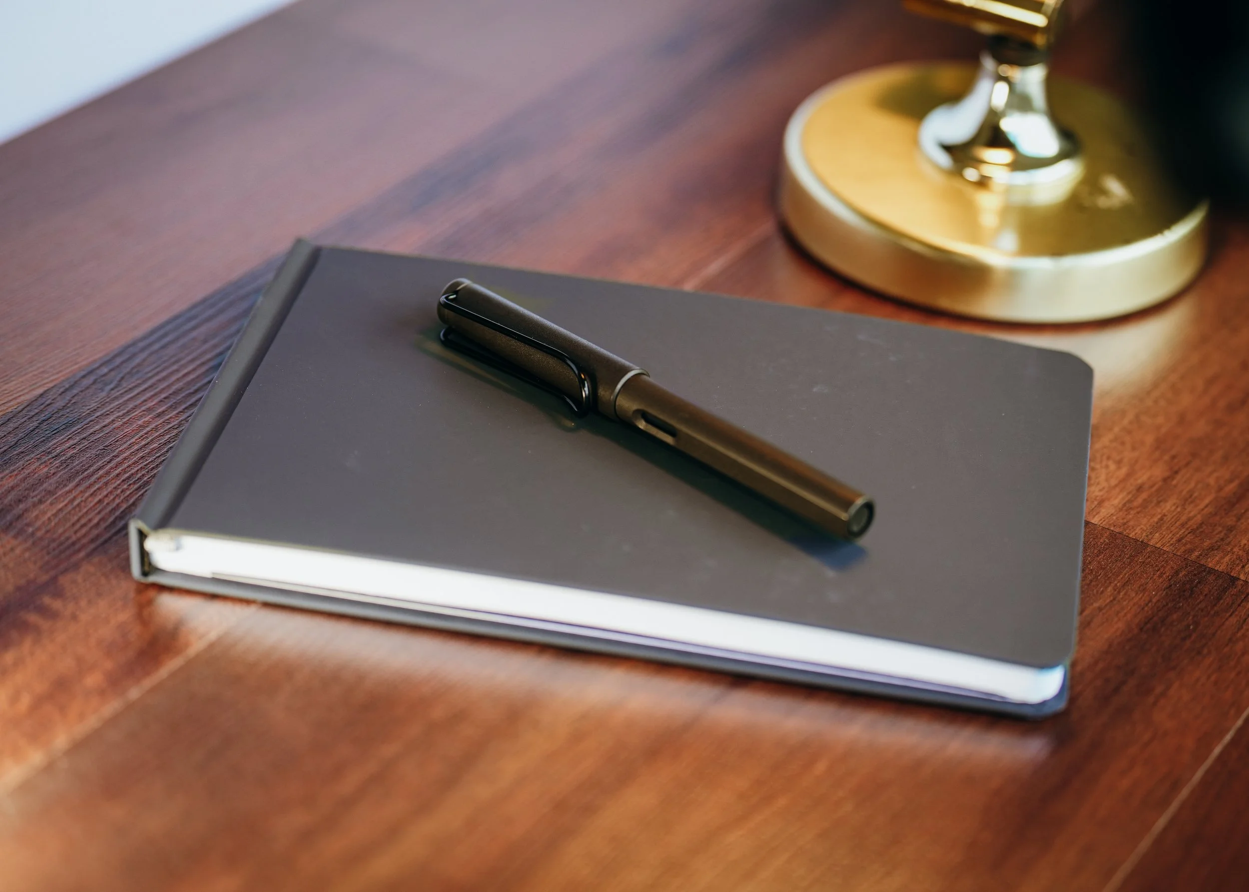
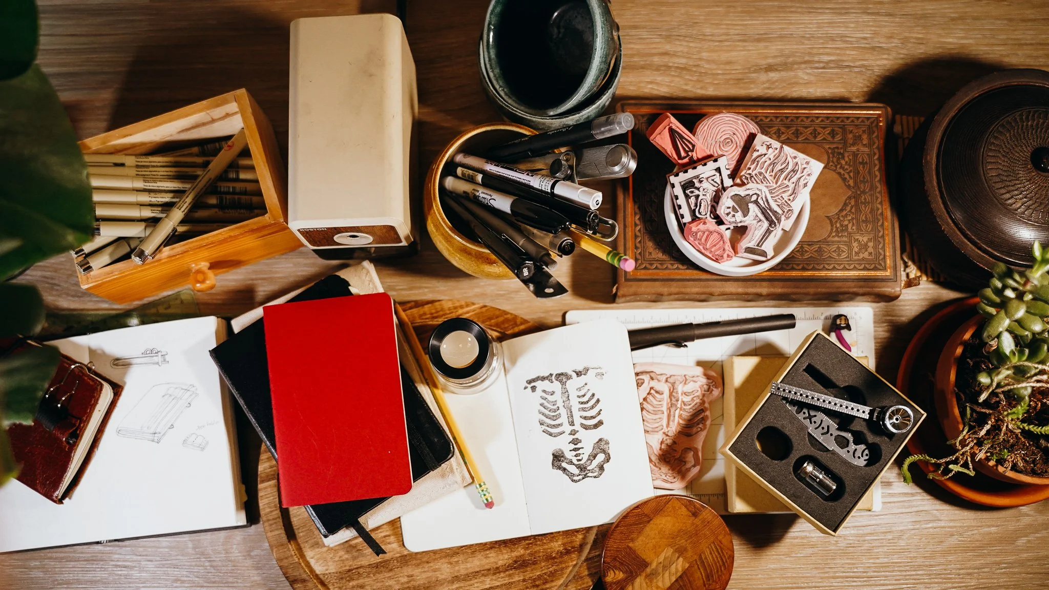
Packaging built around an existing fountain pen and sketchbook (used as a stand-in product to give the identity a real object to wrap around)
APPLICATION
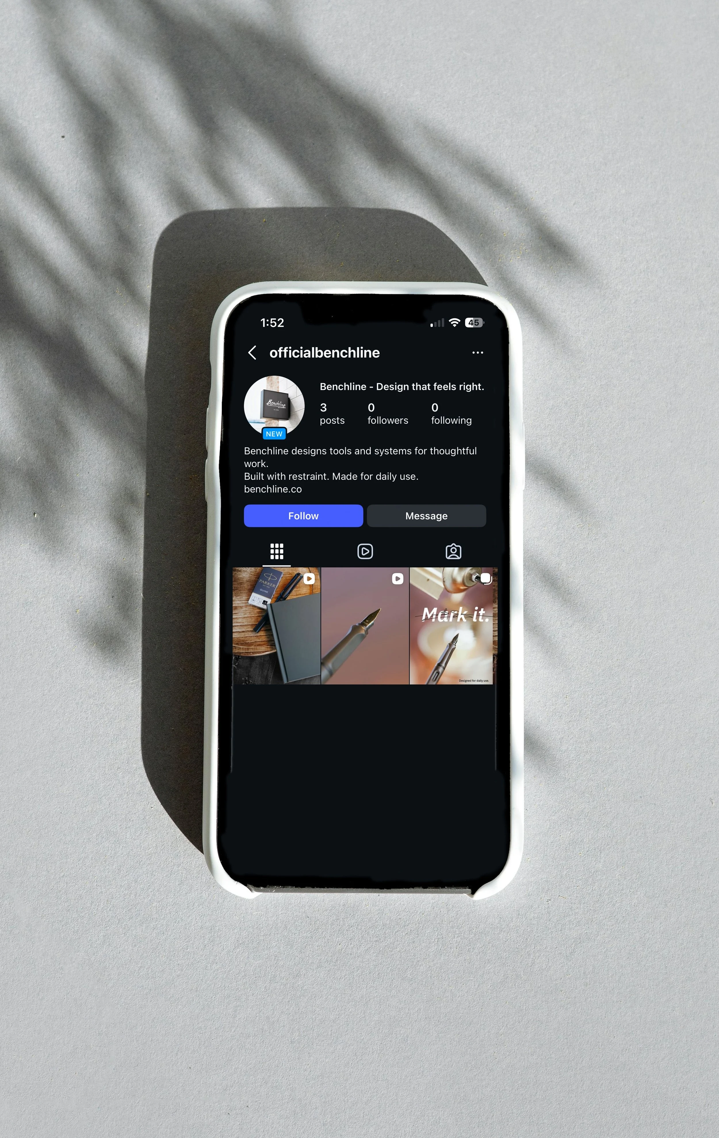
Applied across a full set of real-world touchpoints: digital packaging mockups, a complete brand guidelines PDF, and three social media post mockups with accompanying short-form process clips.
A self-directed, portfolio-only project — its purpose is to prove the system holds together across every format it touches, from packaging to a physical object to social content, without breaking voice or visual consistency.
Lewis and Berry
Layout Hierarchy + Building the Path + Guiding the Eye
CHALLENGE
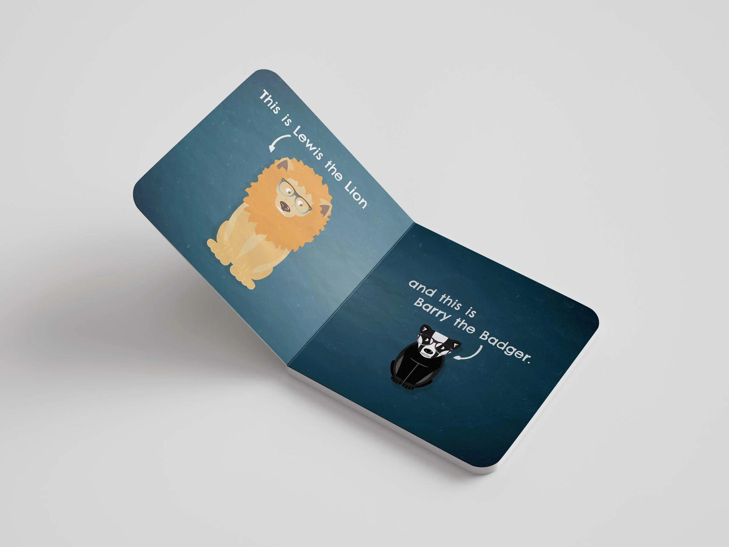
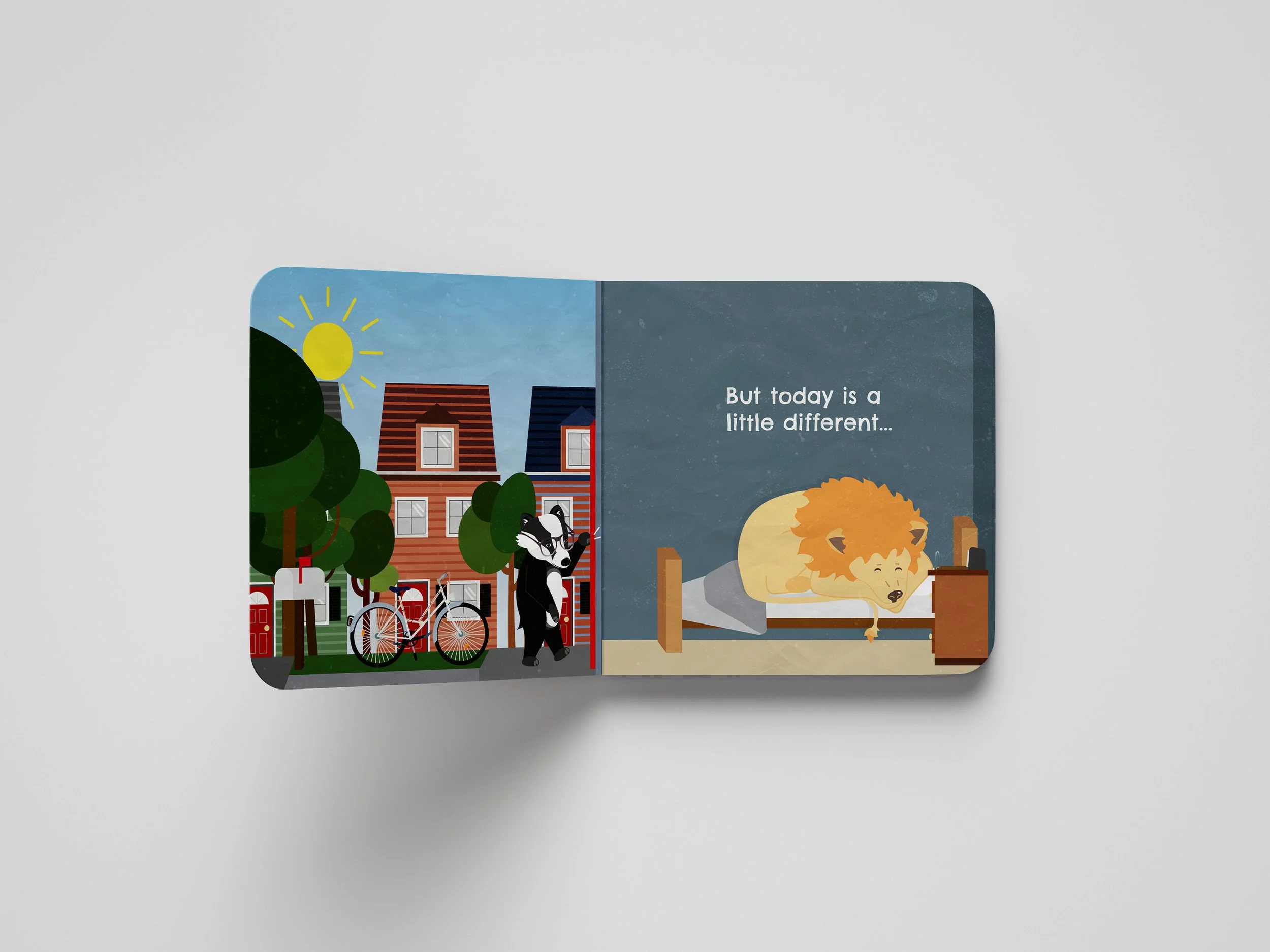
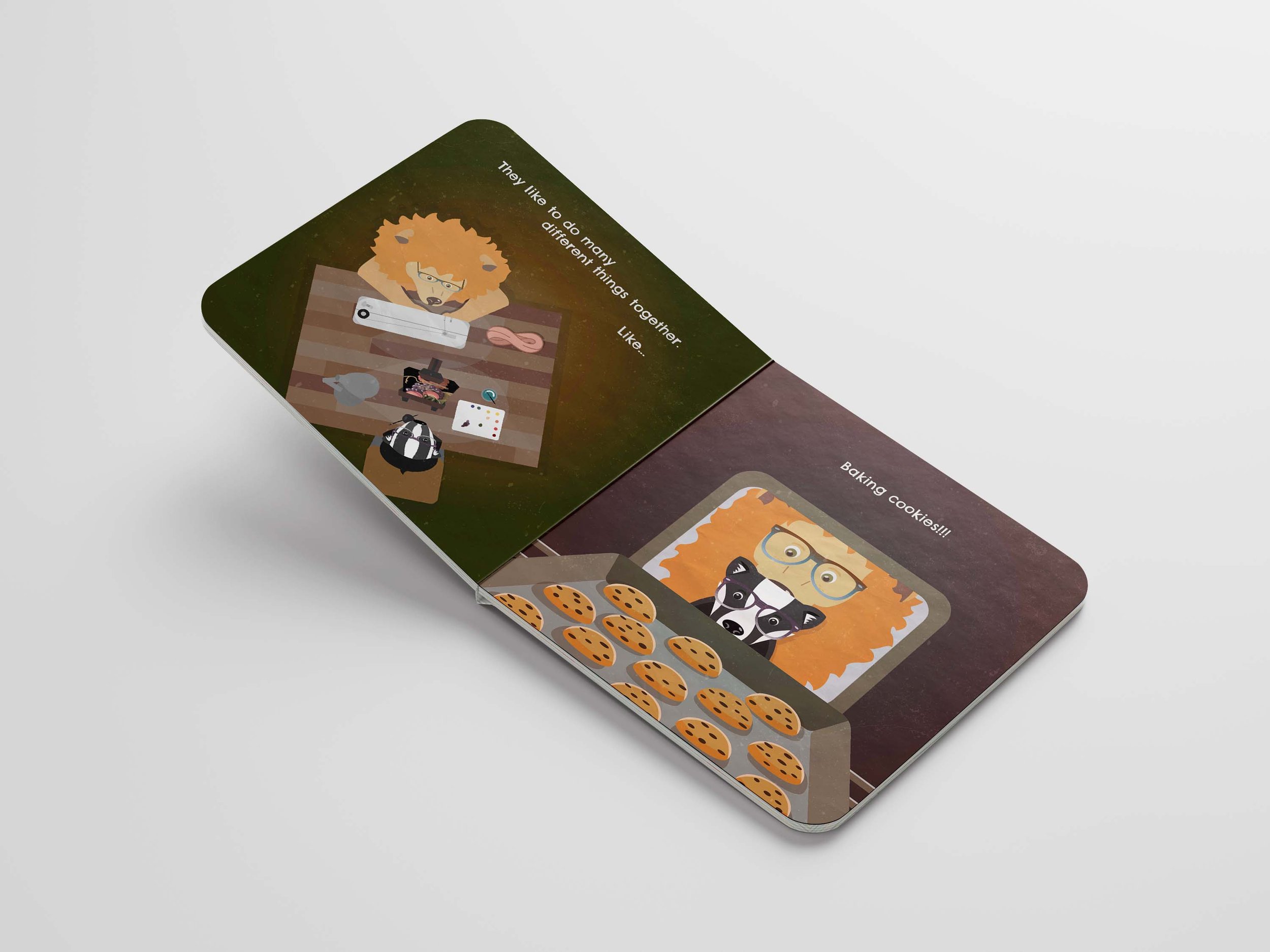
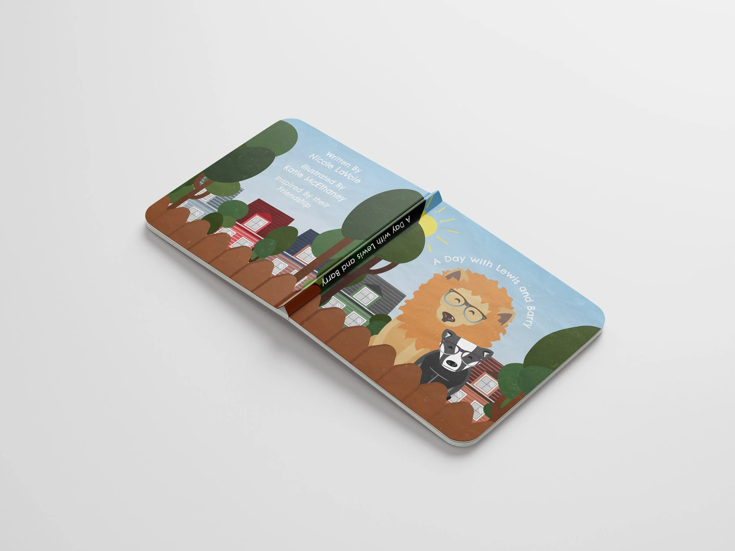
A self-directed college project exploring a difficult design question: How do you communicate depression to a young reader in a way that's honest but not frightening?
The goal was to build a complete children's book — story, character, and visual system — that could open a conversation, not shut one down.
Audience: Elementary-age readers (5–8), with parents and therapy/education professionals as a secondary audience — meaning the book had to work when read alone by a child and read aloud by an adult navigating a hard topic with them.
EXECUTION
Developed the full visual world of the book: character design, illustration, typography, layout, and cover design.
Story and copy were brainstormed collaboratively with the writing department, with layout and pacing built around how those words needed to unfold page by page.
My Role:
Illustrated and designed every page, developed central characters, built a typographic system, composed the layout, and paced the story from cover to final spread.
APPLICATION
This was a self-directed academic project, not commercially published — but it's the clearest proof in this portfolio of my ability to carry a genuinely difficult communication problem from start to finish, from a sensitive brief to a finished physical object.
A Day With Lewis and Berry
Presented as a complete, print-ready book — bound and physically printed, with PDF spreads showing the full page-by-page layout.
YES Athletics × Pepper Clifton
Working Inside Someone Else's Brand + On-Set Direction + Commercial-Ready Output
GOAL
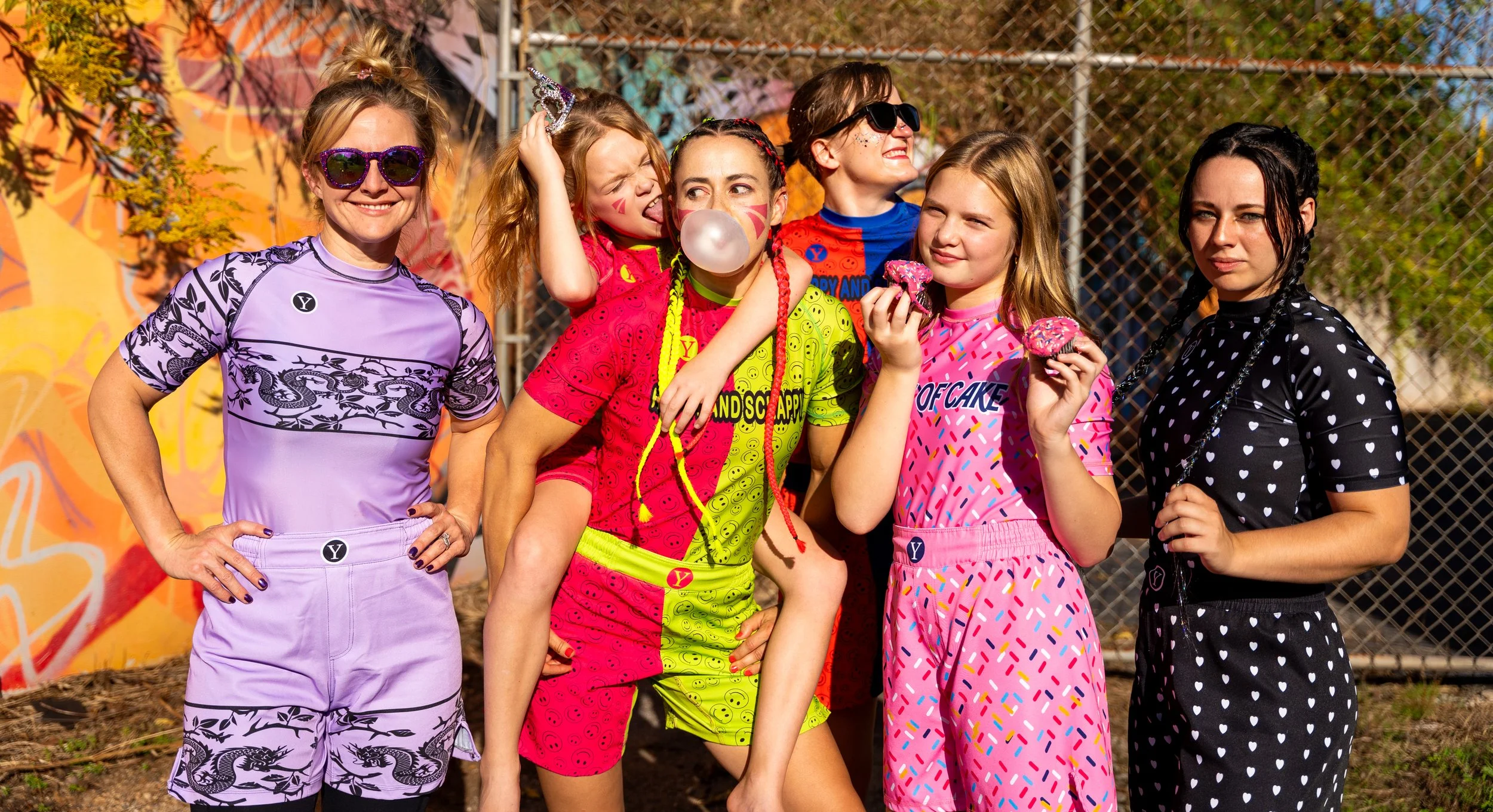
YES Athletics needed a photoshoot to launch "Happy Not Scrappy," a new line of no-gi athletic wear for women who compete in BJJ — five different no-gis, some tied to belt rank colors and others offering a bolder splash of color beyond standard, convenient gym-wear basics, giving women a no-gi that actually felt like theirs.
The audience was women competing in BJJ tournaments and ladies looking for a no-gi with more personality and color options than the basic Walmart athletic clothing.
EXECUTION
Art-directed and shot the campaign: staged poses, adapted the shot list in collaboration with the athletes, and captured a live BJJ competition while wearing the product. Also shot supplementary rolling/action footage outside the original plan, based on what was working in the moment.
Hired directly by Pepper Clifton as a photographer working with YES Athletics. Set up and staged the shoot with athlete models, working from a planned shot list while staying open to suggestions from the athletes themselves rather than directing rigidly.
OUTCOME
Most delivered images were used across social and website highlights; no formal metrics were shared, and there has been no formal rehire yet, though the relationship with Pepper Clifton remains active.
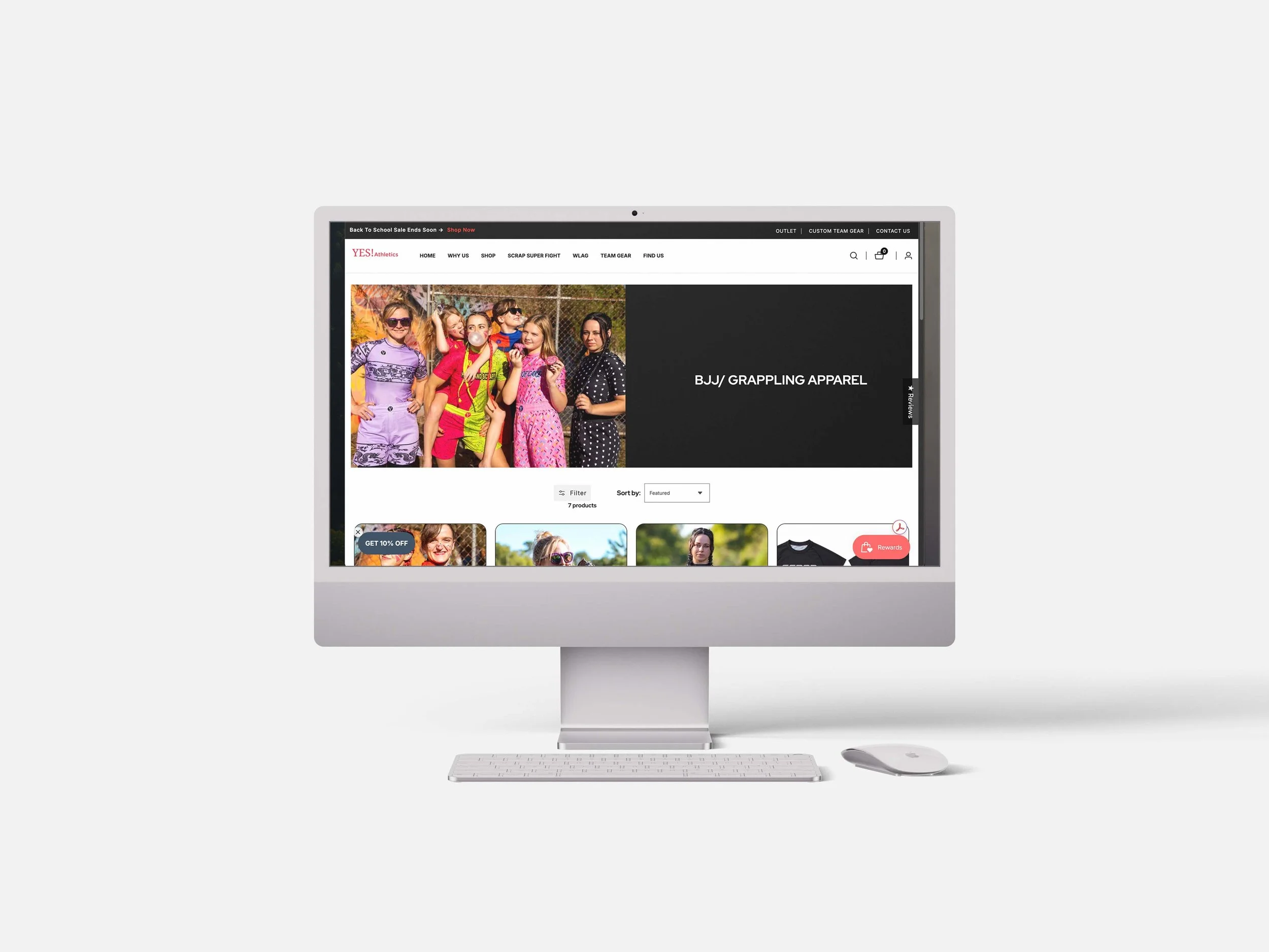
Delivered across YES Athletics' social channels and website highlights, plus on-location coverage at a live BJJ competition. Images are live on YES Athletics' product page today.
About
I'm a graphic designer and visual communicator with a BFA in Graphic Design and 5+ years of experience turning complex information into clear, audience-ready visuals. My focus is presentation design — building the information hierarchy and narrative structure that lets an audience follow an idea without effort.
For three years, I worked in live production for services reaching audiences of roughly 2,000 in person and 10,000 online — including a year and a half as Live Director. Running a live program at that scale means understanding pacing and sequencing in real time: what needs to happen when, how one moment sets up the next, and how to keep an audience with you for an hour without losing them. It's the same instinct I bring to a deck — just without the luxury of a second draft.
I've worked directly with clients from concept through final delivery, and I bring the same process to every project: understand the audience, find the structure hiding in the content, then build the system that carries it.
That same instinct for pacing carried into a documentary project in Uganda, where I edited raw interview and location footage into a short film — deciding which stories to lead with and how to build toward the ask by the end. Same questions as any deck: what goes first, what earns its place, what the audience needs to feel before you ask them for anything.
Thanks for making it to the end!